Ecommerce Product Page Optimization: Best Practices & Examples
It’s official.
- Mobile commerce is on the rise (and not just browsing, but actual conversions)
- Google is getting more serious about their mobile algorithm, separating it from it’s desktop version to account for mobile consumer habits and preferences
- Webstores are officially storytelling complements to Amazon, where price and convenience reign.
These 3 factors all mean one thing:
Your product page is the most important page on your site.
Build your product page effectively and both your traffic and conversions will skyrocket.
Fail to do so, and almost all your marketing and advertising efforts will fall short of goal.
This is risky business – and it’s the same business that digital marketers building landing pages have long been grappling with.
Your product page is now a landing page – at least in function.
This means it needs to (in order of importance):
- Use psychological triggers to convince browsers to add to cart
- Grab consumer attention immediately to the add to cart button
- Fully explain both the product and the company (after all, consumers are bypassing your homepage)
- Build trust in the product and company, often through social proof
- Upsell or resell to increase AOV
There are a variety of ways to do each one of these, and we’ll focus on each section below and show you examples of how folks are turning their ecommerce product pages into landing pages.
The key is to focus on these 3 best practices:
- Keeping your product page focused on the product and consistent with your brand
- Boosting your customers’ loyalty and confidence
- Inspiring customers to become promoters of your brand.
The bottom line is that the quality of your product page — its visual elements, content, and navigation—has the power to make or break your store.
Let’s dive in.
The Anatomy of a Perfect Product Page
Product pages are ubiquitous. They are an industry standard –– a best practice, if you will.
Browse any online store and the multitude of components typical of product pages are recognizable on nearly every site you visit.
And that’s because, as the Baymard Institute so elegantly puts it:
So, the question becomes:
How do you create a high quality user experience on a single ecommerce product page that you can easily replicate across your entire catalog?
Ready to Customize Your Storefront?
BigCommerce is here to help. With Page Builder you can create and edit pages by dragging-and-dropping content, no coding required.
Design Your Store Today
7 Ecommerce Product Page Best Practices
Well, first you make sure that you have all the necessary elements of a product page to begin with.
From there, you can update and optimize.
Here are the 7 product page requirements:
- Feature image
- Gallery or product photos
- Product overview, including title, price, features, CTA and customization options.
- Product description.
- Social proof, including review and ratings.
- Similar product suggestions (upsell and cross sell).
- Human interaction for any help or guidance needed.
Let’s walk through what each one of these are before we dive into examples.
1. Feature Image.
The single most important element of ecommerce product page design is your feature image.
This is an eye-level, mid- to long-shot that showcases your product.
Just imagine what an ecommerce product page would look like with a poorly lit and pixelated image, or even without one at all!
Would you trust a store that failed to properly photograph their products?
Your feature image can excite visitors or turn them away as it forms their first impression and helps them decide whether to look further.
Your best bet is a polished, perfectly centered product image with a white or light background and soft or no shadows.
You’ll also be able to use this image on Amazon in the case you sell your product on that marketplace. In other words, two birds, one stone.
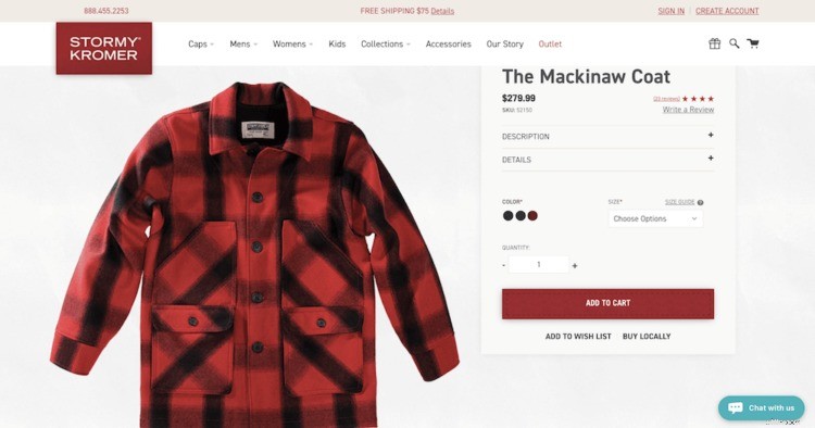
Take a look at Stormy Kromer’s product image below. It is clean. It is large (you can zoom in on it). It looks like it is worth the price.
Beyond the feature image, the product page must convince the browser of the item’s value.
2. Gallery of product photos.
If your feature image successfully wins over your visitors, the next thing they are most likely to do is browse your image gallery.
Galleries are another important aspect of ecommerce product page design. Ideally, you will have about a dozen images in such a gallery, most of them clean-cut, like your feature image, and showing your product from all relevant angles.
It’s also good to include at least one or two in-context or lifestyle images to invite an emotional response from your customers.
You can even add a 360-degree shot, too, that engages consumers even more or a video that conveys other information or answers customers’ questions.
Do you need a dozen extra images?
No. You only need enough images to allow consumers to better visualize your products –– especially the details.
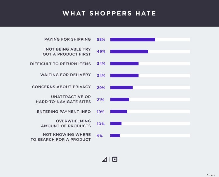
Other than paying for shipping, not being able to touch or feel, or try out, a product is the most hated aspect of online shopping.
If you can solve for that with only a few images, more power to you.
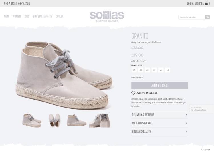
Here’s a great example by Solillas, where they have 4 total images:
3. Title and overview.
Beyond the images, your product page needs to give high-level information of the product right off the bat.
That information includes:
- Product title.
- Price.
- Features and components.
- CTA.
- Customization options.
Ideally, all of this information lives above the fold. That isn’t always possible (in fact, it is rarely possible).
Many brands make up for this with aesthetics.
Instead of using heavy text for an overview (this is *not* the description), they use colors, fonts and icons.
Let’s look at a couple examples.
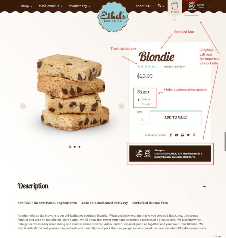
Ethel’s Baking
Ethel’s Baking nails the product image (yum!). Beyond that, the product overview information is clean, branded and clear.
Here is what they do well:
- Use of iconography to highlight important and differentiated product information (in this case, gluten free)
- Branded font as a way to bolster the brand even on a product page (where users may not have even seen the homepage)
- Review visibility in the form of stars (more use of iconography). This helps to build trust.
- Customization options up-front.
ON PRODUCT LANDING PAGES, FOCUS ON TRUST
 There’s so much that goes into ecommerce product page optimizations, including things like product focus, great images, copy quality, product reviews, button placement, access to important information, etc.
The list goes on and on.
My #1 piece of advice is to focus on aspects of your product page that instills trust while diminishing anxiety. These usually come in the form of reviews, shipping, return policies, etc.
— David Feng, Co-Founder and Head of Product, Reamaze
Hook & Albert
Hook & Albert does a great job with their overview section as well.
In fact, later, we’ll look at their entire product page as a great example of a landing page.
Here is what they do well:
- Beautiful imagery up-front, showcasing packing needs in image #2 that is vital to understand for the buyer
- Limited time offer call out to increase conversion
- Review visibility in the form of stars (more use of iconography). This helps to build trust.
- Need to know specs information before the fold (AKA without having to scroll)
- Chat option.
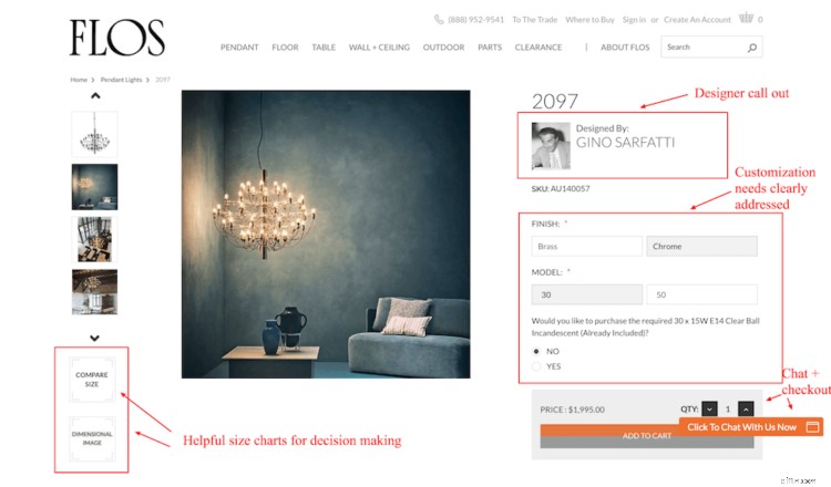
FLOS
Now let’s look at an example that goes a bit more minialstic in an effort to address the brand’s specific audience.
FLOS’s products come at a higher price point, meaning there is a longer buying funnel in general.
To push consumers to purchase, they must include information that helps to visualize the product in their space as well as communicate value.
Here’s how they do it:
- Multiple product-solo and lifestyle product images
- Designer call out to speak to the value prop
- Clear customization options available
- Dimensional sizing charts to help consumers visualize the item in their space
- Chat option.
All right – after you get your product overview accomplished, now it’s time to really drive home your product page SEO capture any lingerers.
To do that, you need unique product descriptions.
-

Metaverse Explained: Understanding Virtual Worlds & Investment Opportunities
You might have heard of the metaverse after Facebook rebranded to Meta, and went all-in on creating virtual worlds. Zuckerberg envisions a world powered by virtual and augmented reality that is filled
-

Top Investment Books: Build Wealth & Financial Freedom
What are investment books? Investment books are books that are meant to educate people about the stock market, the importance of saving, and how to make smart investme
Business
- Blockchain ETFs: Invest in the Future of Crypto and Beyond
- Fixed Annuities: A Comprehensive Guide to Choosing the Right One
- Boost Ecommerce Sales: 15 Trust Signals for Immediate Impact
- Product Content Strategy: Leveraging Technology for Success in 2024
- Ecommerce Product Photography: Boost Conversions with Stunning Visuals
- Black Friday Ecommerce Strategies: Thrive in the Holiday Rush
- Ecommerce Analytics: Drive Sales Growth with Data-Driven Insights
- Boost Ecommerce Sales with User-Generated Content (UGC)
- Choosing the Right Order Management System (OMS) for E-commerce Success
-
 Understanding & Addressing the Racial Wealth Gap
near-term If youre a person of color in the United States youre directly impacted by the racial wealth gap. For starters, youre likely to get paid less and intentionally ...
-
Mutual Fund SIPs: Potential Pitfalls and How to Avoid Them
How many of you invest via SIP? I’m sure a lot of you. The SIP (systematic investment plan) route to investing in mutual funds has gained popularity among retail investors in recent years and wi...