Bitcoin Price History: 2010-2019 Analysis & Visual Chart
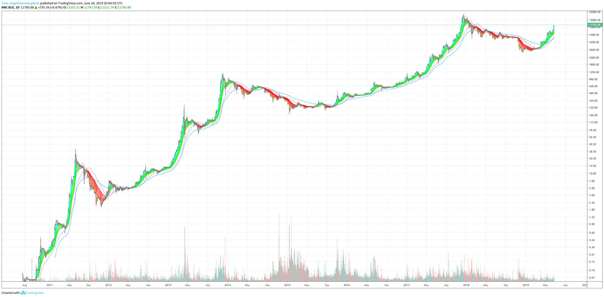
Here is a chart of Bitcoin since it started trading (so BTC 2010 – 2019). This can help you visualize how the recent run looks in comparison to the history of Bitcoin.
Is this run like the 2017 run, is it like the second run of 2013, is it like that run that started in 2012…. or is it like that little run in May 2014?
Who knows, maybe this is different. The idea isn’t to know, the idea is to look with the help of the chart.
TIP: The indicator I’m using is a super guppy (a bunch of EMAs) AKA a ribbon. Specifically this is the very useful TradingView indicator CM SuperGuppy. The gist is red is bear and green is bull. You can see we seem to have entered a bull market.
-

Bitcoin Cash (BCH): A Comprehensive Overview - Features, History & Future
Bitcoin Cash (BCH) is a cryptocurrency created from a hard fork of Bitcoin. It is meant to have quicker transactions than Bitcoin. The fork occurred at block 478,559. At that block the Bitcoin bl
-
Bitcoin Breaks $5k
Bitcoin Breaking $5k, Not Bad Bitcoin broke $5k early morning Oct. 15th, 2017, it then shot up to $5.3k. This marks a milestone for Bitcoin, regardless of what the future holds. The reason this i
Bitcoin
- Bitcoin Bull Run 2015-2017 vs. 2019: Fibonacci Retracement Analysis
- Bitcoin Price Analysis: 2016-2019 Trends & Wall Street Insights
- Bitcoin Price Cycles: Analyzing Major Runs Since 2010
- Bitcoin's Viability: Analyzing Network Activity & Future Prospects
- Bitcoin Price History & Value: A Comprehensive Overview
- Bitcoin Unlimited: Understanding the Proposed Block Size Upgrade
- Bitcoin Gold: Understanding the 2017 Hard Fork & Decentralization Goals
- Bitcoin Cash (BCH): A Comprehensive Overview - History, Features & Scalability
- Bitcoin Price Surge: Weekend Bullishness in June 2019?
-
 Bitcoin Diamond (BTM) Explained: Fork, Risks & What You Need to Know
Everything You Need to Know About Bitcoin Diamond Bitcoin did another hard fork, the coin created this time is Bitcoin Diamond. The fork occurred at block height 495866. [1][2] NOTE: Some people ...
-
Bitcoin Gold (BTG): Should You Hold or Claim Your Coins?
Why You Should Consider Not Selling Your Bitcoin Gold; But Should Be Careful Retrieving It If you held Bitcoin during the Bitcoin Gold fork, you now have equal parts Bitcoin Gold. Although you ca...