Understanding Payoff Graphs vs. Profit & Loss Diagrams in Options Trading
Investors use payoff graphs vs profit & loss diagrams to determine returns from options trading. Option payoffs are simply the reward or return that one can expect from investing in or being involved in options trading. One can either earn a profit on the invested amount or, in the case of unfavorable conditions, incur a loss. An options payoff is represented either graphically through a payoff graph or diagrammatically through a profit & loss diagram.
Summary
- Options payoffs refer to the reward or return realized from investing in or being involved in options trading.
- Payoff graphs are the graphical representation of an options payoff. They are often also referred to as “risk graphs.”
- Profit & loss diagrams are the diagrammatic representation of an options payoff, i.e., the profit made or loss incurred on the investment made.
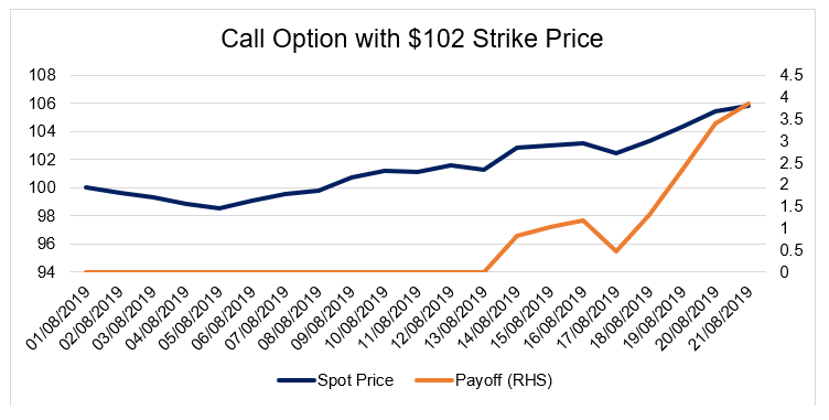
What are Payoff Graphs?
Payoff graphs are the graphical representation of an options payoff. They are often also referred to as “risk graphs.” The x-axis represents the call or put stock option’s spot priceSpot PriceThe spot price is the current market price of a security, currency, or commodity available to be bought/sold for immediate settlement. In other words, it is the price at which the sellers and buyers value an asset right now., whereas the y-axis represents the profit/loss that one reaps from the stock options. The payoff graph looks like the graph outline shown below:
What are Profit & Loss Diagrams?
Profit & loss diagrams are the diagrammatic representation of an options payoff, i.e., the profit gained or loss incurred on the investment made. The diagram below shows a profit and loss diagram for a “long call option.”
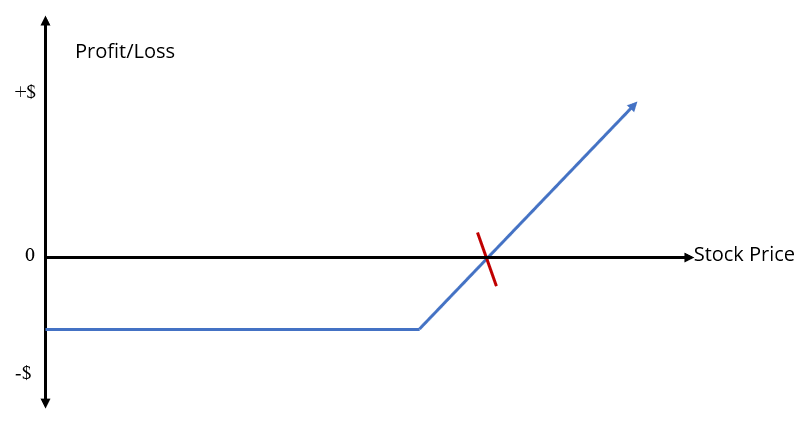
The vertical axis indicates the profit/loss earned or incurred. All amounts above zero level represent a profit earned, and all amounts below the zero level represent a loss incurred. The horizontal axis indicates the movement of the option stock price, which increases as the graph moves towards the right.
Usually, in an options pay-off profit and loss diagram, the blue line, like the one shown in the diagram above, is the profit and loss line. The point where the profit and loss line intersects the stock price line, indicated by the red line in the diagram above, is called the “break-even pointBreak-even Point (BEP)Break-even point (BEP) is a term in accounting that refers to the situation where a company's revenues and expenses were equal within a specific accounting period. It means that there were no net profits or no net losses for the company - it "broke even". BEP may also refer to the revenues that are needed to be reached in order to compensate for the expenses incurred.”
The break-even point in a profit and loss diagram is the point where an options strategy would neither make any profits nor incur any losses. Beyond this point, it’s either a profit gained or a loss incurred. There are four basic situations that are usually depicted through profit and loss diagrams. One of them, as shown above, is the long call option diagram. The other three situations are:
- Long put option diagram
- Short call option diagram
- Short put option diagram
The four situations are the basic forms of a profit and loss diagram associated with options trading. The most common example of such a situation is the “iron condor strategy.” The strategy is shown in the diagram below:
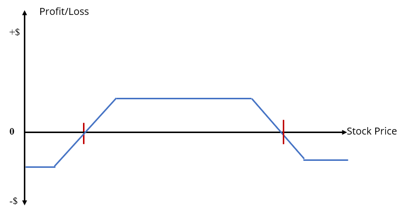
The iron condor strategyIron CondorThe iron condor is a trading strategy for options that uses two spreads, both vertical. One is a call (which is the option to buy), and the other is a put is a combination of selling a call stock option and a put stock option and buying a call stock option and a put stock option, all at the same time. Here, the options strategy is such that the profit is only earned up to a certain limit – as specified by the red check marks on the diagram above. However, if the option stock price increases or decreases significantly beyond the limits, the strategy will start to incur a loss.
Additional Resources on Payoff Graphs vs Profit & Loss Diagrams
CFI is the official provider of the Financial Modeling and Valuation Analyst (FMVA)™Become a Certified Financial Modeling & Valuation Analyst (FMVA)®CFI's Financial Modeling and Valuation Analyst (FMVA)® certification will help you gain the confidence you need in your finance career. Enroll today! certification program, designed to transform anyone into a world-class financial analyst.
In order to help you become a world-class financial analyst and advance your career to your fullest potential, these additional resources will be very helpful:
- London International Financial Futures & Options ExchangeLondon International Financial Futures and Options Exchange (LIFFE)The London International Financial Futures and Options Exchange (LIFFE) is a futures exchange located in London. Sir Brian Williamson established LIFFE on
- Options: Calls and PutsOptions: Calls and PutsAn option is a derivative contract that gives the holder the right, but not the obligation, to buy or sell an asset by a certain date at a specified price.
- Spread TradingSpread TradingSpread trading – also known as relative value trading – is a method of trading that involves an investor simultaneously buying one security and selling a
- Trading MechanismsTrading MechanismsTrading mechanisms refer to the different methods by which assets are traded. The two main types of trading mechanisms are quote driven and order driven trading mechanisms
-
Herrick Payoff Index: Understanding Derivative Market Trends
The Herrick Payoff Index is a forward-looking technical analysis tool used to identify trends in derivative markets. Using price, volume, and open interest, the index provides an overview of money flo
-

Cash Flow vs. Profit: Understanding the Difference for Investors
Cash flow is a gross measure of all funds delivered to a company, while profit is a net amount earned in a given term. On any financial statement, a company will list its cash flow as part of ne
invest
- Profit & Loss Statement for Loan Modification: A Guide for Self-Employed Borrowers
- Understanding Insurance Loss: Definitions & Types
- Understanding Capital Losses: Definition, Calculation & Examples
- Loss Aversion: Understanding the Psychology of Financial Decisions
- Option Profit & Loss Graphing Tool for Excel
- Profit & Loss Statement (P&L): Definition & Key Components
- Beyond the Profit/Loss Ratio: Rethinking Forex Risk Management
- Analyzing Profit & Loss Statements: A Guide to Company Financial Health
- Profit & Loss Statement (P&L): A Step-by-Step Guide for Businesses
-
Understanding Affidavits of Loss: A Guide for Investors
The affidavit of loss can be a very important tool for investors to understand. Here are the basics of the affidavit of loss and what it means to you as an investor. The Affidavit of Loss This d...
-
Understanding Consequential Loss: Business Interruption Insurance
A consequential loss is an indirect adverse impact caused by damage to business property or equipment. A business owner may purchase insurance to cover any damage to property and equipment, and may ...