Point and Figure Chart: A Comprehensive Guide for Technical Analysis
A Point and Figure (P&F) chart is made up of multiple columns of X’s that represent increases in a security’s price and O’s that represent decreases in price. A column of X’s is always followed by a column of O’s, and vice-versa. The chart is composed of multiple boxes, with each box equal to a certain price level. The box is filled with an X if price increases to that level. The box is filled with an O if price decreases to that level.
P&F charts are regarded as “timeless” because, unlike traditional charts, time is not a factor. On traditional charts, a security’s price is plotted for specified time intervals, even if the price remains unchanged. With P&F charts, new information is plotted on the chart only if there is price action, a price change. If the price is static, even for a long period of time, then the chart is left unaltered. These charts are a useful tool in technical analysisTechnical Analysis - A Beginner's GuideTechnical analysis is a form of investment valuation that analyses past prices to predict future price action. Technical analysts believe that the collective actions of all the participants in the market accurately reflect all relevant information, and therefore, continually assign a fair market value to securities., particularly helpful for identifying resistance and support levelsResistance LineA Resistance Line, sometimes also known as a Speed Line, helps identify stock trends and levels of support and resistance. Resistance lines are technical indication tools used by equity analysts and investors to determine the price trend of a specific stock..
A popular P&F charting method is the three-box reversal. This is a filtering process that requires a minimum of three boxes be filled (with either three X’s or three O’s) before reversing the present column on the chart and starting a new one in the opposite direction.
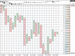
Merely talking about P&F charts can be confusing. But they are relatively easy to understand by looking at them. The image below shows a simple example of a P&F chart. The overall downtrend is clear from the fact that the O columns are, overall, much longer than the X columns.
Benefits of P&F Charts
While a P&F chart is one-dimensional in that it is focused only on price changes, not time, it can offer several benefits to tradersSix Essential Skills of Master TradersJust about anyone can become a trader, but to be one of the master traders takes more than investment capital and a three-piece suit. Keep in mind: there is a sea of individuals looking to join the ranks of master traders and bring home the kind of money that goes with that title. and analysts. The benefits include:
- Filtering out insignificant price action – market noise
- Easy visualization of support and resistance levels
- A timeless tool for price movement analysis
- Helps a trader focus on the significant price movements
Creating a P&F Chart
Prices on a P&F chart are characterized by rising columns of X’s and falling columns of O’s. Every X and O sits in a box. The box represents a predetermined price range. The larger the box size, the fewer X’s and O’s that will be charted.
Every point and figure chart has a predetermined, specified reversal amount. This dictates how much a security’s price needs to move in the opposite direction to warrant charting a new column in that direction. When the reversal amount is reached, a new column begins next to the previous one. The new column moves in the opposite direction and is represented by the opposite character. If a column of O’s reverses, a new X column is started, and vice versa.
The amount that a column must reach in order to reverse – its reversal distance – is the product of the reversal amount and the box size. For example, if the box size is 2 and the reversal amount is 4, an 8-point price move is required for a reversal/new column. As long as the price of a security does not move more than the established reversal distance, the existing column continues.
There are several different ways to establish box scaling or size. The most commonly-used method involves a predefined table of price ranges to dictate what the box’s size should be. The table below shows a typical table of price ranges and box sizes.
Price Range Box Size Under 0.250.06250.25 to 1.000.1251.00 to 5.000.255.00 to 20.000.520.00 to 1001100 to 2002200 to 5004500 to 1,00051,000 to 25,0005025,000 and up500
Bar and Candlestick Charts
There are alternatives to P&F charts, most notably, bar chartsBest Excel CoursesThis guide provides an overview of the most popular and best Excel courses for finance professionals working towards completing CFI's online program. Excel is one of the most important tools for any financial analyst, and having great spreadsheet skills can make the difference between moving up the ladder or not. and candlestick charts.
A bar chart is plotted using an x-axis and y-axis and rectangular bars to represent the prices/values of the security being charted. A bar chart, unlike a P&F chart, is two-dimensional. The height and width of each bar are established by the factors set within each category: what the x- and y-axes are used to represent. In most cases, either the x- or y-axis represents time, a factor that P&F charts do not consider.
Candlestick charts reflect price action with clearer visuals and in more detail than bar charts. Each candlestick on a chart represents one specified time period (e.g., one hour or one day). Candlesticks clearly show four vital pieces of information for traders: the opening price, the high for the period, the low, and the closing price. The candlesticks form patterns that traders use as technical indicators. Again, time is an integral part of this type of chart, unlike P&F charts.
While sometimes considered an archaic form of charting price movements, point and figure charts can be incredibly useful. If nothing else, P&F charts provide a different point of view for analysis, which can be compared to indications gleaned from candlestick or bar charts.
Additional Resources
We hope you’ve enjoyed the CFI guide to point and figure charts. CFI is a global provider of Financial Modeling training and career advancement for finance professionals. To learn more and expand your career, explore the additional relevant resources below:
- How to Read a Stock ChartHow to Read Stock ChartsIf you’re going to actively trade stocks as a stock market investor, then you need to know how to read stock charts. Even traders who primarily use fundamental analysis to select stocks to invest in still often use technical analysis of stock price movement to determine specific buy and sell, stock charting
- Investing for DummiesFinanceCFI's Finance Articles are designed as self-study guides to learn important finance concepts online at your own pace. Browse hundreds of articles!
- Long and Short PositionsLong and Short PositionsIn investing, long and short positions represent directional bets by investors that a security will either go up (when long) or down (when short). In the trading of assets, an investor can take two types of positions: long and short. An investor can either buy an asset (going long), or sell it (going short).
- Technical Analysis – A Beginner’s GuideTechnical Analysis - A Beginner's GuideTechnical analysis is a form of investment valuation that analyses past prices to predict future price action. Technical analysts believe that the collective actions of all the participants in the market accurately reflect all relevant information, and therefore, continually assign a fair market value to securities.
-
Understanding Dealer Markets: How Market Makers Function
A dealer market is a financial market where dealers post prices they would be willing to buy and sell specific securitiesTrading SecuritiesTrading securities are securities purchased by a company for
-
Understanding Delta: A Key Risk Measure in Derivatives
Delta is a risk sensitivity measure used in assessing derivativesDerivativesDerivatives are financial contracts whose value is linked to the value of an underlying asset. They are complex financial in
invest
- Understanding Bid and Ask Prices in Financial Markets
- Understanding Divergence in Technical Analysis: A Guide
- Understanding Forward Prices: Definition & How They Work
- Understanding Hedging Strategies: A Comprehensive Guide
- Kagi Chart Explained: A Clearer View of Price Action
- Pump and Dump Schemes: Understanding Securities Fraud
- Understanding Slippage in Trading: Causes & Impact
- Understanding Strangle Options: A Comprehensive Guide
- Understanding Volatility: A Key Indicator of Investment Risk
-
 Commodity Valuation: Understanding Intrinsic Value & Market Pricing
Commodity valuation is the process of deriving the intrinsic value of a commodity under optimal market conditions. In a perfectly competitive free market, the price of a commodity reflects the intrins...
-
 Covered Calls: A Comprehensive Guide for Investors
A covered call is a risk management and an options strategy that involves holding a long position in the underlying asset (e.g., stockStockWhat is a stock? An individual who owns stock in a company is...