Kagi Chart Explained: A Clearer View of Price Action
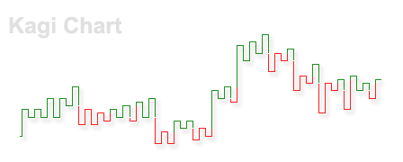
The Kagi chart is a type of chart that shows the price movements of an asset. Different from a candlestick chart or other conventional types of charts, a Kagi chart does not contain a time axis, which allows it to show price changes more clearly and effectively. Kagi charts are used as a tool to support technical analysisTechnical Analysis - A Beginner's GuideTechnical analysis is a form of investment valuation that analyses past prices to predict future price action. Technical analysts believe that the collective actions of all the participants in the market accurately reflect all relevant information, and therefore, continually assign a fair market value to securities.. It was originally developed in Japan since the inception of the Japanese stock market.
Summary
- A Kagi chart shows the asset price movements without a time axis, which presents the price change more effectively than a candlestick chart.
- A vertical Kagi line indicates the high and low of an asset trend, while a horizontal line represents a reversal of price movements.
- The change of thickness/color of Kagi lines takes place when the price reaches the previous high or low.
Understanding Kagi Charts
A Kagi chart shows the movements of an asset’s price through a series of vertical lines linked with short horizontal lines. A notable feature of Kagi charts is that they do not contain a variable of time. The diagram below is a simple example of a Kagi chart to help you to understand how it is constructed.
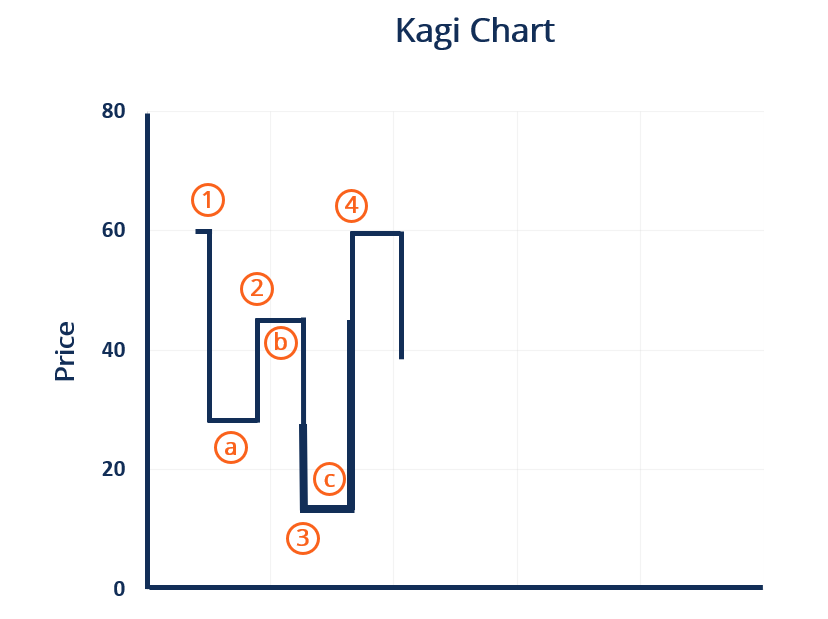
The vertical lines (marked by numbers) display the unidirectional movements of price, as the short horizontal lines (marked by alphabets) signal reversals of price movements. The vertical line (1) shows the asset price dropping from $60 to $24. The price drop may happen all of a sudden or gradually for a consecutive period since the chart lacks a time axis. Line (1) is followed by a horizontal line (a), which means a reversal in the price drop, and the price starts to rise.
Line (a) would not appear until the price’s increased by a pre-determined reversal amount, depending on the type of security and the trader’s preference. Typically, it is set as 4% of the current price. Other reversal value setting methods include the average true range (ATR)Average True RangeThe average true range (ATR) is a price volatility indicator showing the average price variation of assets within a given time period. method and the fixed-point method. The vertical line (2) following Line (a) presents an increase in price from $24 to $42 after the reversal. Line (b) signals the end of the upward trend, and the price dropped to $17, as shown by the vertical line (3).
Another feature of the Kagi chart is the change in the thickness of the lines. Every time the price moves above the previous high or below the previous low, the thickness of the lines switches. For example, according to Line (2), the price increased to $42, which is below the previous high at $60, and thus the line remains thin.
The vertical line (3) switches from thin to thick after the price broke the previous low at $24. After the price increased above the previous high at $42, Line (4) switches back to thin. In some Kagi charts, the lines switch between colors, which functions the same as the switch of thickness.
The switch of thickness or color can be used by tradersSix Essential Skills of Master TradersJust about anyone can become a trader, but to be one of the master traders takes more than investment capital and a three-piece suit. Keep in mind: there is a sea of individuals looking to join the ranks of master traders and bring home the kind of money that goes with that title. as transaction signals. When the Kagi line moves above the previous high, a buy signal is created, and a sell signal appears when the Kagi line drops below the previous low. Therefore, the switch at Line (3) gives a sell signal, as the switch at Line (4) gives a buy signal.
Kagi Chart vs. Candlestick Chart
Although both depict the price movements of an asset, Kagi charts and candlestick charts are different in many aspects. Here are some of the major differences.
- Candlestick charts show asset prices along with time. A candlestick is generated for each period, which can be every hour, day, week, or so on, while Kagi charts do not count time.
- Each candlestick shows the high, low, opening, and closing prices during a certain period of time. It also means that there may be several reversals of price movements in each candlestick. Comparing a candlestick, a Kagi line contains much less information, merely indicating the high and low of an upward or downward trend.
- Traders can set the time period that each candlestick represents based on their needs, while they cannot set the time basis for a Kagi chart. Instead, the reversal amount needs to be determined.
The large amount of time-based information that a candlestick chart contains can overburden traders who rely on technical analysis. It can be difficult for them to identify the significant price movements from noisy fluctuations.
Hence, the major advantage of a Kagi chart is that it allows traders to focus on the major price trends and changes by dropping unnecessary fluctuations. Through the neat vertical and horizontal lines and clear switch in color or thickness, traders can easily identify the meaningful asset trends and profitable trading signals.
Related Readings
CFI offers the Capital Markets & Securities Analyst (CMSA)™Program Page - CMSAEnroll in CFI's CMSA® program and become a certified Capital Markets &Securities Analyst. Advance your career with our certification programs and courses. certification program for those looking to take their careers to the next level. To keep learning and advancing your career, the following resources will be helpful:
- Advanced Technical AnalysisAdvanced Technical AnalysisAdvanced technical analysis usually involves using either multiple technical indicators or a rather sophisticated (i.e., complex) indicator. "Sophisticated"
- Forecasting MethodsForecasting MethodsTop Forecasting Methods. In this article, we will explain four types of revenue forecasting methods that financial analysts use to predict future revenues.
- How to Read Stock ChartsHow to Read Stock ChartsIf you’re going to actively trade stocks as a stock market investor, then you need to know how to read stock charts. Even traders who primarily use fundamental analysis to select stocks to invest in still often use technical analysis of stock price movement to determine specific buy and sell, stock charting
- Japanese CandlestickJapanese CandlestickJapanese Candlesticks are a technical analysis tool that traders use to chart and analyze the price movement of securities. The concept of candlestick charting was developed by Munehisa Homma, a Japanese rice trader.
-
Technical Analysis: Understanding Speed Lines and Forecasting Market Trends
The technical analysisTechnical Analysis - A Beginners GuideTechnical analysis is a form of investment valuation that analyses past prices to predict future price action. Technical analysts believe th
-

Value Line Composite Index: Definition, History & Composition
The Value Line Composite Index was launched in 1982. It was the first market index to trade in the futuresFutures and ForwardsFuture and forward contracts (more commonly referred to as futures and for
invest
- Advance-Decline Line: Understanding Market Sentiment & Trends
- Black-Scholes Model: Understanding Stock Option Pricing
- Double Top Pattern: Definition, Trading Signals & Analysis
- Understanding the Forward Curve: A Comprehensive Guide
- Understanding the Heath-Jarrow-Morton (HJM) Interest Rate Model
- Heikin-Ashi: A Comprehensive Guide to Trend Analysis
- Heston Model: Understanding Volatility in Financial Options
- Understanding Market Support: What is 'Holding the Market'?
- Understanding Offering Price: A Guide for Investors
-
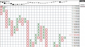 Point and Figure Chart: A Comprehensive Guide for Technical Analysis
A Point and Figure (P&F) chart is made up of multiple columns of X’s that represent increases in a security’s price and O’s that represent decreases in price. A column of X&rsquo...
-
 Understanding the Security Market Line (SML) | Capital Asset Pricing Model
The security market line (SML) is a visual representation of the capital asset pricing model (CAPM)Capital Asset Pricing Model (CAPM)The Capital Asset Pricing Model (CAPM) is a model that describes th...